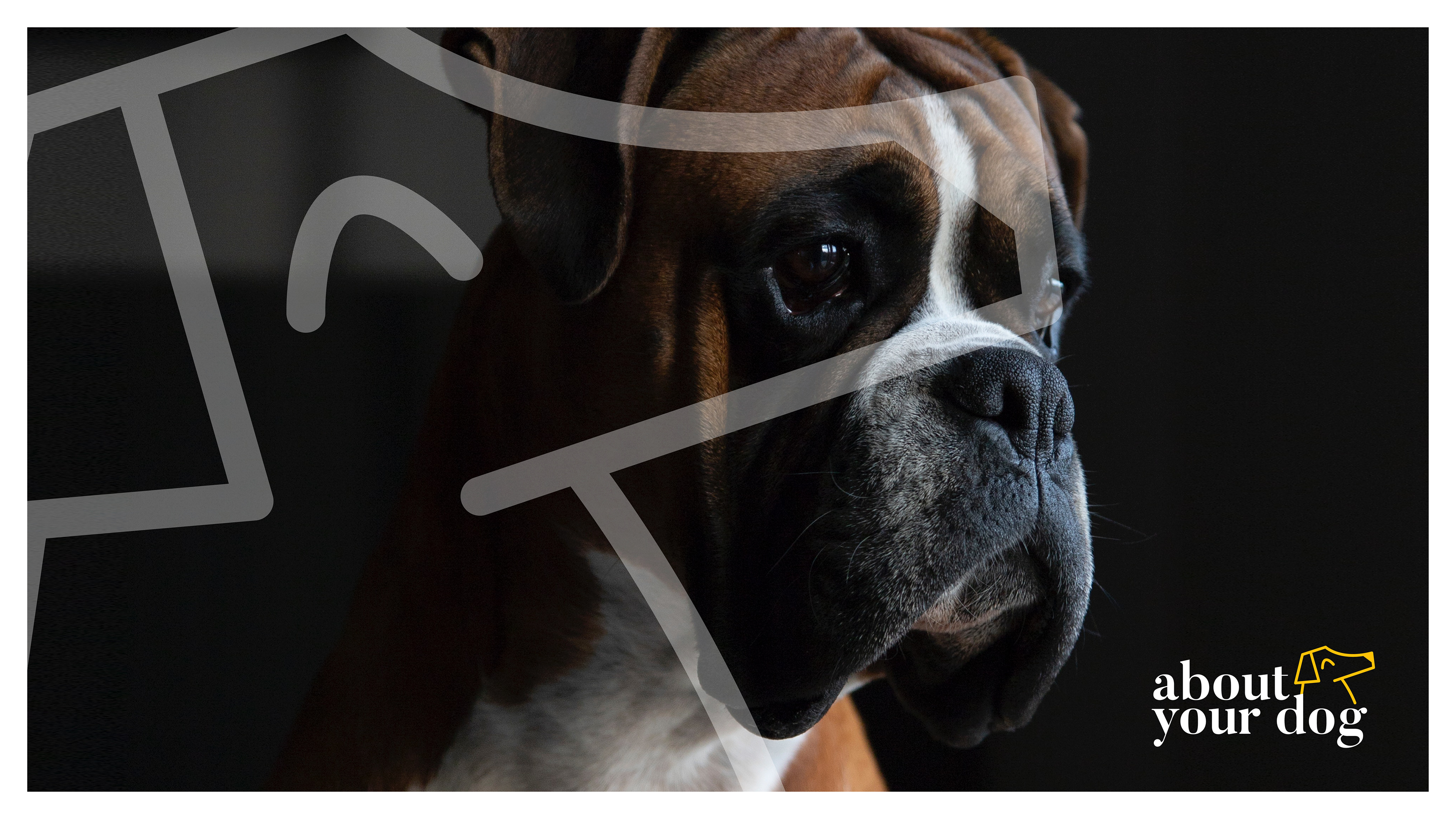
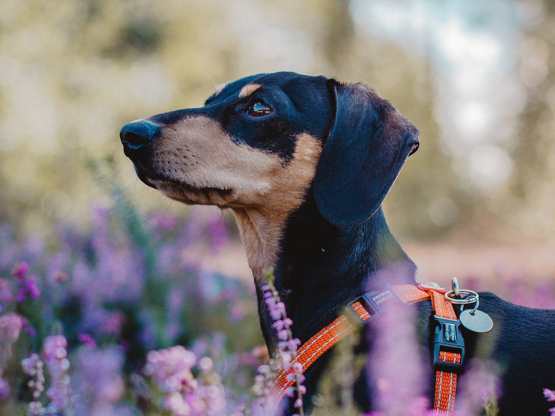
This branding project was for a local dog training business who wanted to have a professional but approachable brand image in order to have the right images to entice dog owners to use their services. For this project I wanted to create something with bold colour to make sure they stood out from other businesses of this type, I also wanted the friendly and approachable feel to shine through using yellow as the primary colour for the branding. The icon I created for the logo can be used in a very versatile way across all touchpoint of the brand in order to always tie back to the brand message and at the core the very purpose of the business, to train dogs.
